A brand contains many elements to provide a strong message. Without doubt the single most important element of your businesses brand is your logo, but what makes your logo a great logo?
We decided to look into the world of logo design, the principles of designing a great logo and what rules your logo should stick to. Daily we see hundreds (if not thousands) of logos which we notice consciously and sub-consciously, and for your brand to be recognised you need to follow the 5 principles of great design as your starting point.
Any logo should be:
- Simple
- Memorable
- Timeless
- Versatile
- Appropriate
Here are the principles in more detail and some examples of how the best do it.
Simple
Simplicity is key to recognition, your logo may flash past someone, be reproduced at a small size or be seen from a long distance so you need it to be simple and easy to recognise. The principle of K.I.S.S (Keep It Simple Stupid) is very often followed in the design world, and the reason for this is because simple means less fuss, easy to work with and familiarity sets in easily.
Memorable
Being memorable is key to any logo, why? Well, why wouldn’t you want your logo (and in turn your business) to be remembered? If your logo is simple and recognisable then anyone and everyone will remember it!
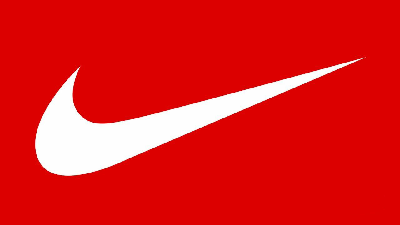
Nike is the perfect example of the simple principle, the ‘tick’ is synonymous with Nike and instantly recognisable when we see it. So recognisable that the tick is rarely seen with the words NIKE alongside.
Memorable
Being memorable is key to any logo, why? Well, why wouldn’t you want your logo (and in turn your business) to be remembered? If your logo is simple and recognisable then anyone and everyone will remember it!
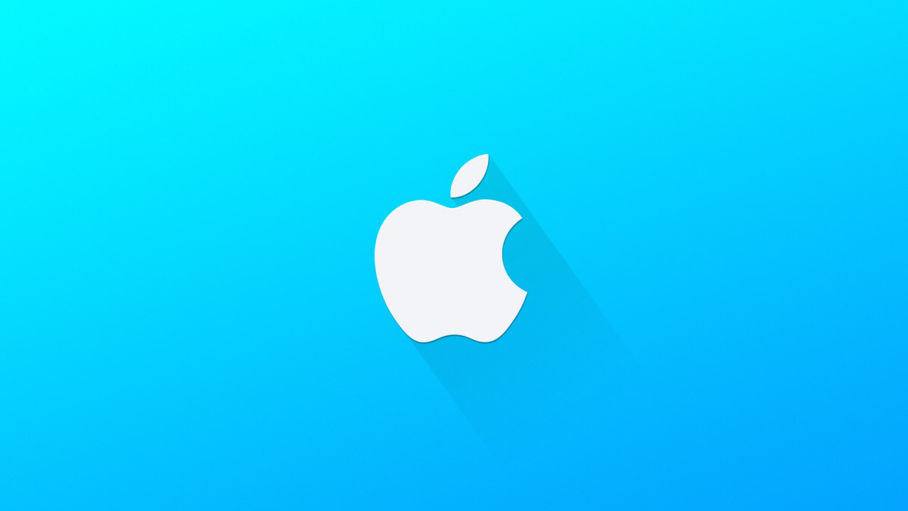
Apple, probably one of the most recognisable logos on the globe. The simplicity of this logo with its iconic shape and stature make it memorable. The symbol is the most important part of the logo, our brains think visually and the saying “a picture paints a thousand words” is very true.
Timeless
Your logo should be timeless, endure the test of time and not date quickly. Too often (some) designers will follow trends or fashions in design but in a very short space of time the logo will date and look out of place very quickly. How is this avoided? By making the logo timeless, not following fads and giving the logo a unique feel but looking ahead to how the logo may feel in 5, 10 or even 20 years time.
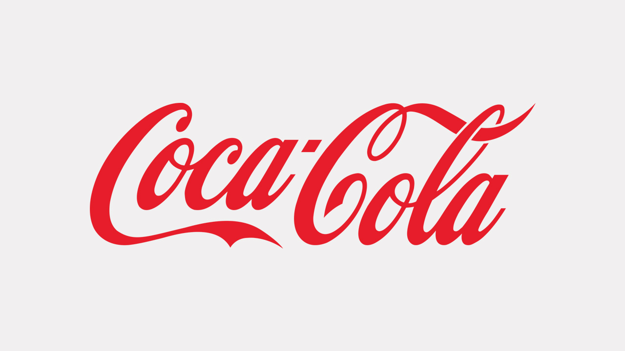
Coca-Cola, again a logo recognised all over the world. In its simplest form, it has gone unchanged for over 130 years whilst Coca-Cola’s competition has changed numerous logos and brands to fit the time period. Does your logo have a timeless feel?
Versatile
Versatility is key to your logo being easy to use and not causing you headaches later in life. A logo should be able to be placed in varying situations and adapt to that situation without being manipulated each time. All logos should be provided in vector format to allow for scalability and usage across all channels ie. can your logo be scaled to fit a billboard or side of a vehicle? Only a vector logo will allow this.
The process followed by Phase is to design logos in black and white at the very start of a project, this helps our team to focus on content, structure and form before going deeper into the logo and subjected by colour.
Other factors such as screen usage or print usage must be considered and the logo must be versatile to be used in both RGB and CMYK formats.
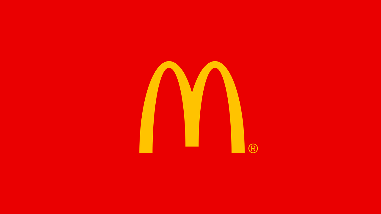
McDonald’s logo, the famous Golden Arches has been used for nearly 50 years and is instantly recognisable around the world. Its simple form is adaptable for both large signs that sit on fast roads but is equally recognisable on small food packaging.
Appropriate
A brands logo should fit what sector that organisation represents, if you own a children’s toy shop then you wouldn’t expect to have a similar logo to an accountant. Your logo should be appropriate for what it is that you do but this doesn’t mean that it has to be overly obvious either. For example, if you own a burger joint you don’t necessarily need a logo with a burger, car logos don’t need to include cars…but they do need to be appropriate to their client focus or the message they want to portray.
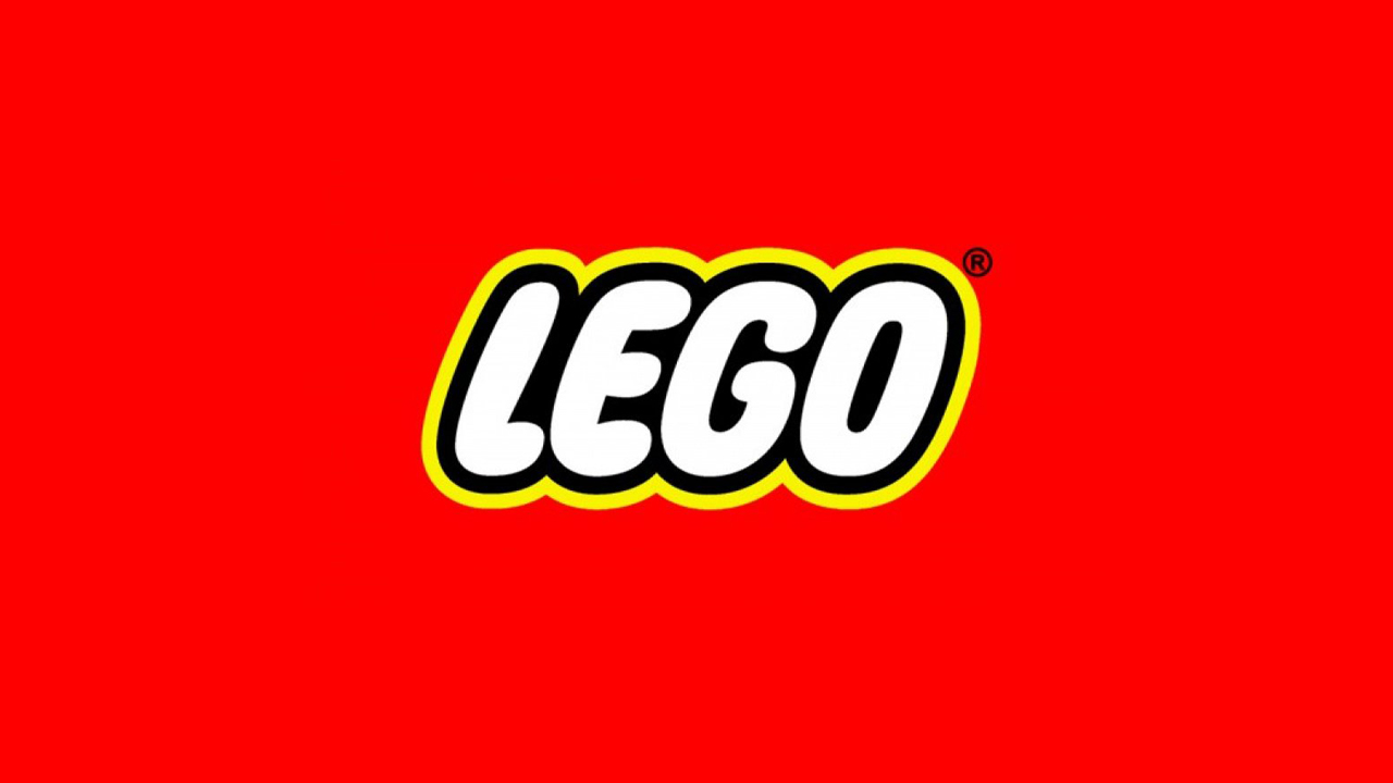
Lego is the perfect example of an appropriate logo, it is not self-explanatory (it doesn’t show any sign of a lego brick) but it symbolises the age group that they appeal to. With a fun logotype and bold colours, they can adapt for both children and adults alike…appropriate, simple, memorable and versatile.
Summary
In summary, for your logo to be great the starting point is always these 5 principles. Keep to these and the basis of your brand has a strong start. As always every rule is there to be broken however these principles will ensure a basic standard which emphasises professionalism and quality.